State of the Union: Ten Economic Graphs That Should Scare The Hell Out Of You
January 25th, 2012“Crisis takes a much longer time coming than you think, and then it happens much faster than you would have thought.” -MIT economist Rudiger Dornbusch
At President Obama’s State of the Union Address this year, which was heavy on recycled platitudes and light on substance, the president did more to prepare for the upcoming general election than actually give a genuine assessment of the state of the union, but that’s pretty par for the course. A sincere state of the union by the President of the United States may be more than most Americans are ready for yet– the horror of listening to the president describe the true economic realities we face might be more than many people could handle. I hope I’m wrong and most Americans would welcome an honest word from a major politician as a breath of fresh air.
What would a sincere state of the union address look like? The president could just show us graphs of economic data and leave it at that. It would be the most radical truth-telling we have heard from the White House in a long time. If you really want to know the state of union and you have the stomach for it, here are ten economic graphs that show just how precarious the state of the union really is and just how long our current economic troubles are likely to last:
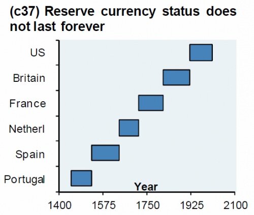
1. Graph of the world’s reserve currencies and the duration of their reserve currency status since 1400 C.E.
Are you seeing this? When I saw this on ZeroHedge earlier this month, I decided instantly that this graph should be everywhere. Nothing lasts forever and this graph eloquently and poignantly demonstrates that world reserve currency status is no exception. What does “world reserve currency” mean? It means that different countries use that currency to trade with each other. Whoever controls the world’s reserve currency has a major, but temporary and ultimately artificial advantage over those nations and people who do not control the world’s reserve currency. Right now it’s the dollar, but as you can see from the graph above, the dollar is the sixth world reserve currency in six hundred years, meaning if history is any indication, we’re about due to lose that status. When this happens, the value of the dollar will dramatically collapse and the effects on the U.S. economy will be catastrophic.
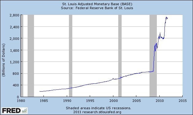
2. Graph of the Adjusted Monetary Base
Pictured above, the Adjusted Monetary Base is measured and published by the research arm of the Federal Reserve system, which is based at the Federal Reserve Bank of St. Louis. The simple definition of this measure, according to the St. Louis Fed is “the sum of currency (including coin) in circulation.” So the graph you see above shows the amount of money there is out there, the amount of U.S. dollars that exist and circulate in the economy. In the span of a single year, you can see that the growth rate in the supply of money went from steadily upward sloping, but nearly horizontal to suddenly and dramatically vertical, and that in just a few short years the entire supply of money would not only double, but triple!
Now just what can we expect to happen to the value of money if its supply increases so dramatically? According to basic, uncontroversial, textbook economics, we would expect its value to decrease. You would need more and more units of such a vastly increasing money supply to buy the same goods and services. That’s called inflation. I’m sure those of you reading this understand that easily enough, but if anyone you know needs it spelled out in the most simple and easy-to-grasp way, here’s a very short explanation I gave at an End the Fed march in Nashville last year.
3. Graph of the value of the US Dollar since 1913
After viewing the graph of the adjusted monetary base above and its accompanying explanation, this graph of the U.S. dollar’s value in 1913 dollars should make a lot of sense! 1913 was the year that brought us the Federal Reserve bank. Since then, the dollars it prints have lost 95% of their value and are presently worth only five cents in 1913 dollars. Inflation is real, destructive, and still happening…
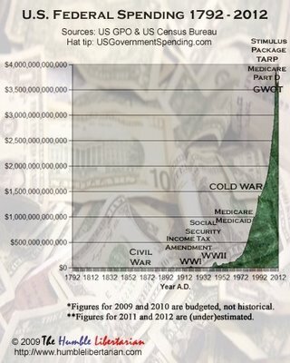
4. Graph of US federal spending 1792 – 2012
Back in 2009 I compiled federal spending data since 1792 into a spreadsheet and made a graph. That’s what you’re looking at here. Telling, isn’t it? The line graph of federal spending above is horizontal for most of American history and so close to the x-axis at $0 that you can’t even see it until the Civil War, where if you squint, you can see a tiny dot representing the dramatic bump in federal spending. After the war, the graph goes on to hug the x-axis until WWI where it makes a more noticeable bump, then in the middle of the 20th century it suddenly grows into a large hump representing WWII spending, though notice the dramatic drop in federal spending following WWII, the most dramatic drop in federal spending that the United States has ever seen. Some analysts predicted economic disaster, but instead the economy boomed. From there on out, the graph continues to slope upward as the welfare state and military industrial complex become entrenched features of American society. The graph takes a dramatic turn for the vertical around the same time that the final link between the dollar and gold is broken in the 1970s. The nearly vertical line becomes steeply, asymptotically vertical in the Bush-Obama era of open-ended warfare, limitless “stimulus” for well-connected corporations, and monetary expansion like we’ve never seen before (as per graph #2 of the Adjusted Monetary Base).
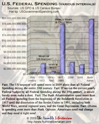
5. Graph of comparative US federal spending over various intervals
Just to create a level of perspective that might give you anything from mild economic vertigo to intense nightmares for the rest of this week, I then took these data on yearly federal spending and compiled them into a bar graph comparing federal spending over various intervals of American history, as you can see above.
Fact: The US taxpayer spent more in 2009 alone than all Federal spending during the entire 19th century. Fact: If we cut the current yearly Federal budget by all Federal spending during the 19th century, it would barely even make a dent. That’s how big the Federal budget is now. Fact: The American taxpayer spent more in 2009 than all Federal spending during the entire 180 years from 1792 to 1972, and the growth in spending shows no signs of slowing.
Fact: The Bush Administration alone spent more than all U.S. Federal spending from the beginning of the Bolshevik Revolution in 1917 until the dissolution of the Soviet Union in 1991, including both World Wars, several regional wars, and the Great Depression. Fact: Obama is spending even more than Bush. Fact: If you are an American citizen, your government has mortgaged your future and indentured you to the service of the staggering debt (plus interest) that the U.S. Treasury owes to the Fed and to bondholders in China, Russia, Saudi Arabia, and elsewhere.
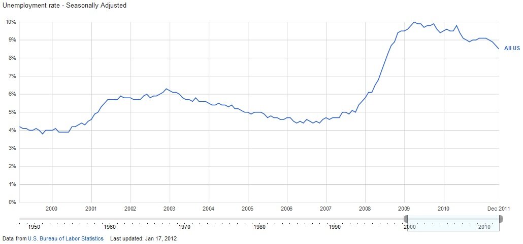
6. Graph of US unemployment rate since 2000
Ready for the consistently high levels of structural unemployment that characterize the inefficient welfare state and regulatory state economies of Europe? Well they’ve come to America, and the following graphs about employment indicate that they’re here to stay.
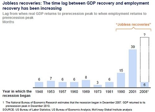
7. Graph of time lag between GDP recovery and employment recovery
Does this make sense? Each year along the x-axis in the graph above represents the start of a recession over the last sixty years. The bars and numbers above them represent the number of months that it took for employment to return to its prerecession peak after GDP returned to its prerecession peak. If GDP returned to its prerecession peak in December of 2010, that means that employment won’t recover until 2014 IF it rebounds as “fast” as it did after the 2001 crash. Since the trend is upward-sloping, we can look forward to employment finally bouncing back to prerecession levels around ??? 2015? 2016? …and that’s if GDP doesn’t take another dive by then, or we don’t see the beginnings of a catastrophic monetary collapse. Who feels bullish on employment?
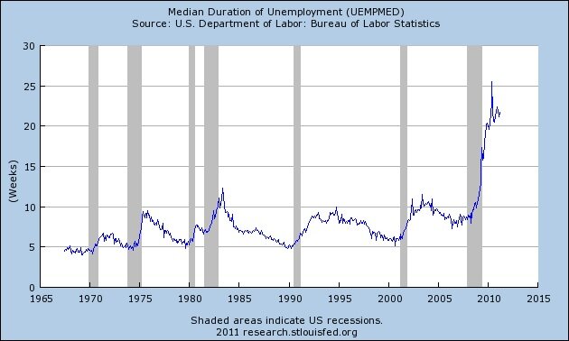
8. Graph of median duration of unemployment since 1970
Not only have overall employment rates taken longer and longer to bounce back after a recession, the time any individual worker spends being unemployed has gotten longer and longer as well, from a median of 5 weeks in the 1960s, to a median of as much as 25 weeks in more recent years. In the 1960s, if you had a little over a month of savings to pay your expenses, you would be working again before it ran out. In the 2010s, you need something more like five months of savings to weather the storm of unemployment should you lose your job to downsizing… and that’s probably enough for the government to consider you a terrorist or something. I mean, what kind of freak saves? Go be patriotic and spend! Everything’s going to be alright. Just spend! /sarcasm
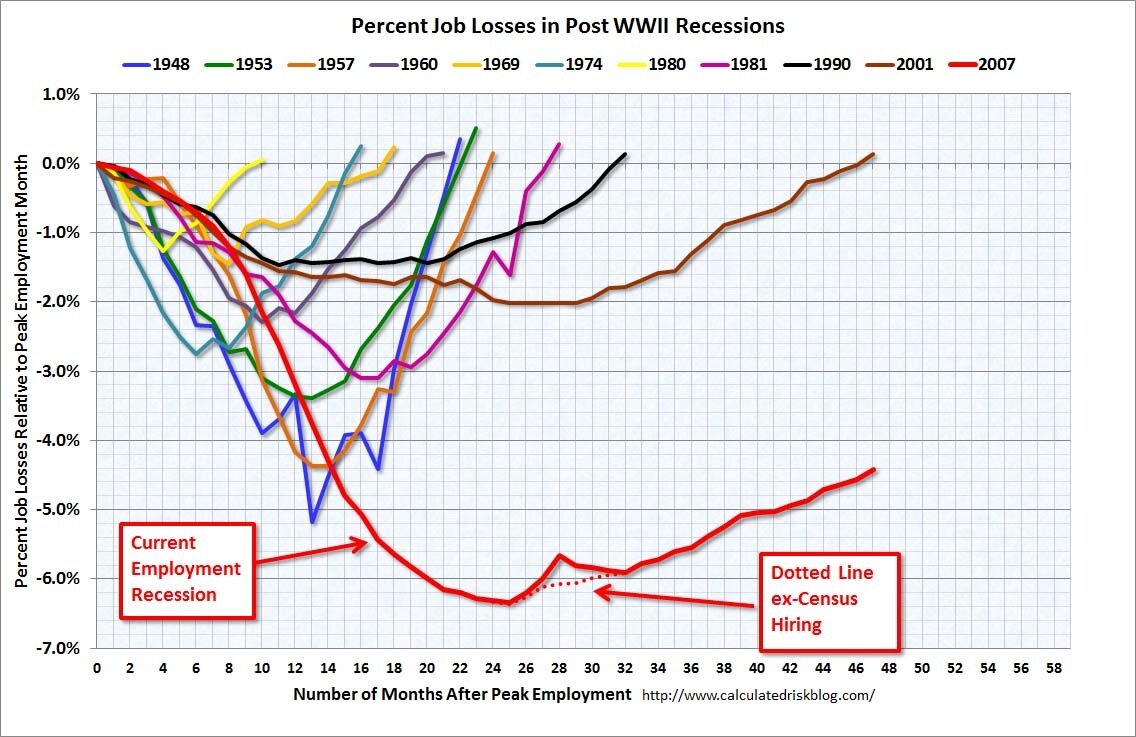
9. Graph of job losses over time in post-WWII recessions
I’m not even going to say anything about this one. Just stare at those lines like I did until they suck every last drop of wide-eyed, gullible optimism out of you and you realize that this graph is actually just an optical illusion: the longer you stare at it the more sane Glenn Beck looks. Yeah, Glenn Beck. At least he knows the economy isn’t going to recover any time soon. Am I saying most of the mainstream media is less sane and astute in its view of the world than Glenn Beck? I think I might be. There you go, I’ve destroyed your faith in the economy and in mainstream journalism with one graph. Scared yet?
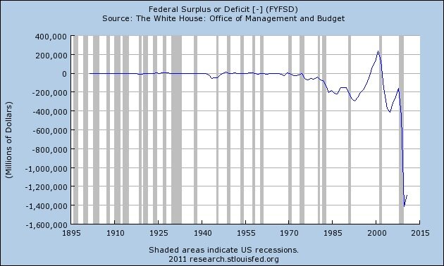
10. Graph of federal budget surplus or deficit since 1900
Since the 1970s, we’ve gone from measuring the federal deficit– the amount the federal government spends each year that it doesn’t actually have– in tens of billions to trillions with no signs of slowing down. This is unsustainable. It can’t keep going like this. It will collapse. The collapse will be painful. The results won’t be pretty. You should be scared. The state of our union is broke, indebted, languishing in economic malaise with no end in sight, and on the verge of full-blown economic catastrophe.
And don’t forget to visit our official website to learn more about the Silver Circle Movie:http://SilverCircleMovie.com


